BLOOMING PETS
LOGO • BRANDING • COLLATERAL
overview
Blooming Pets is a pet food company founded in South Texas in the United States. Started from fostering a puppy that was kicked from their home, Blooming Pets started humble beginnings. From saving one puppy, to another and another then kittens, then both. It quickly became important to take care of the vulnerable without a voice and one of the most effective ways to take care of any living being - is food. Diet became the focus and with that, needed to build a brand from logo to collateral, promoting natural diets for specific species. Where the litter, can become fitter.

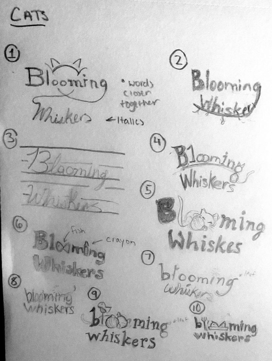
logo design
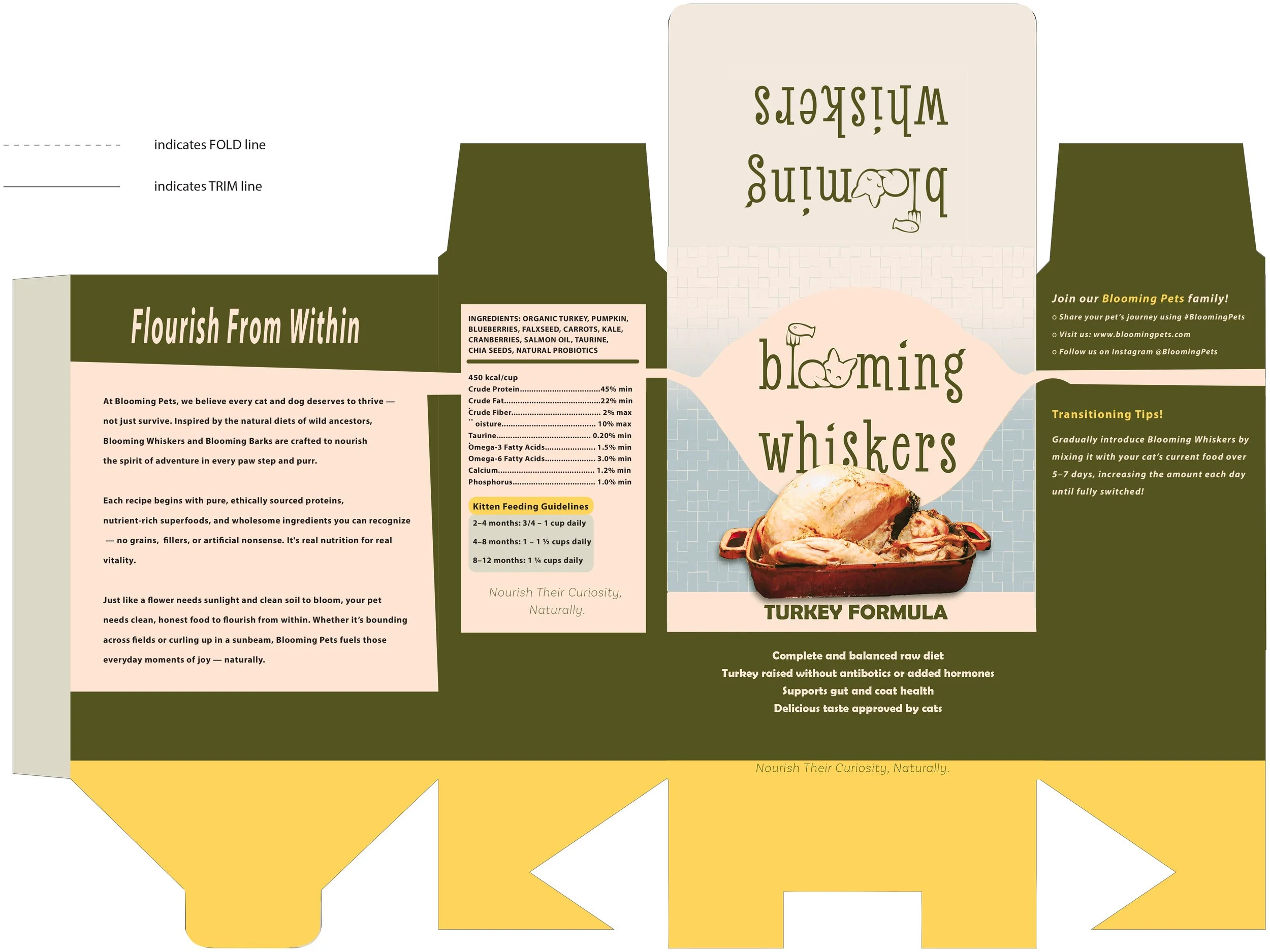
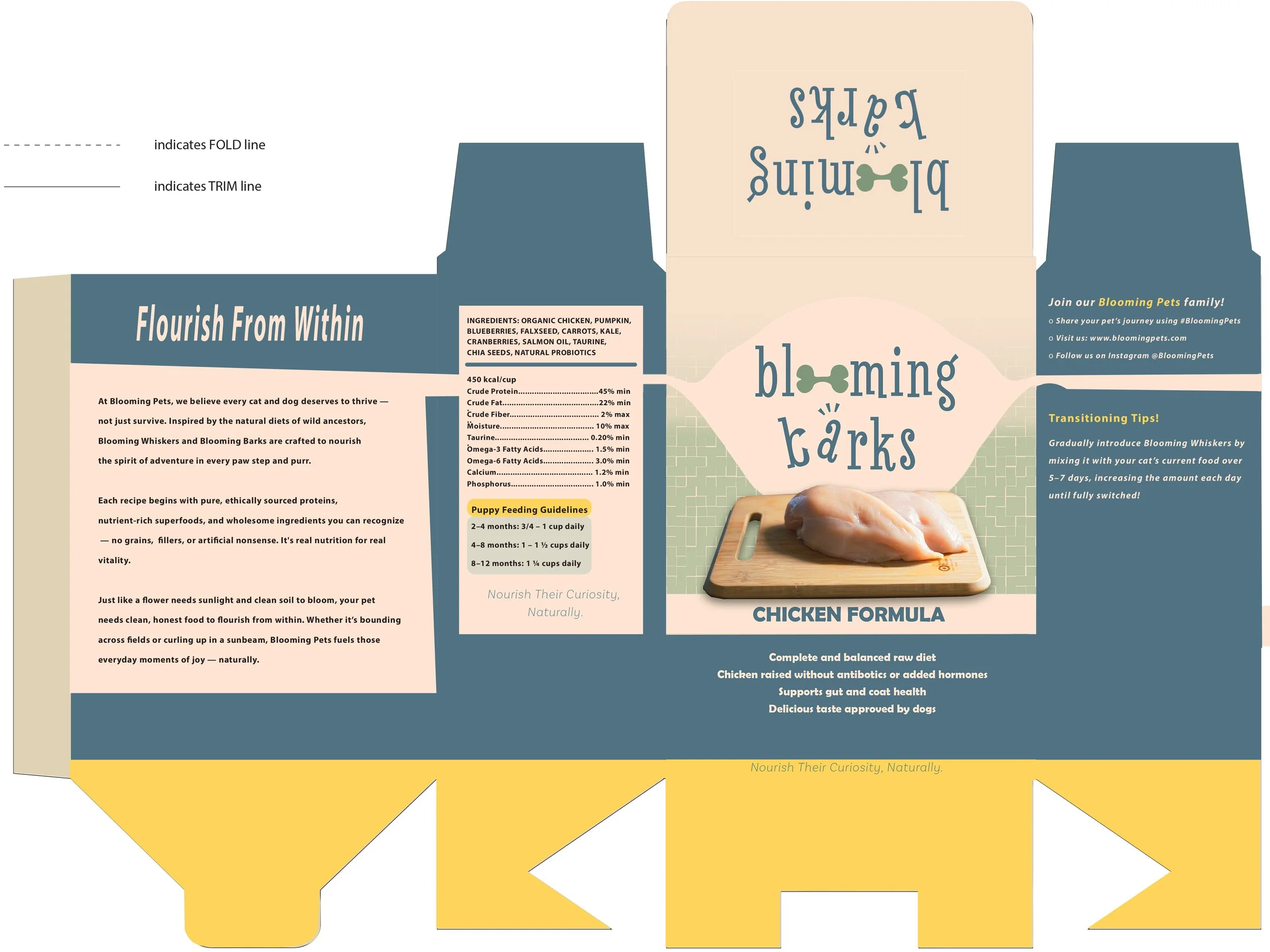
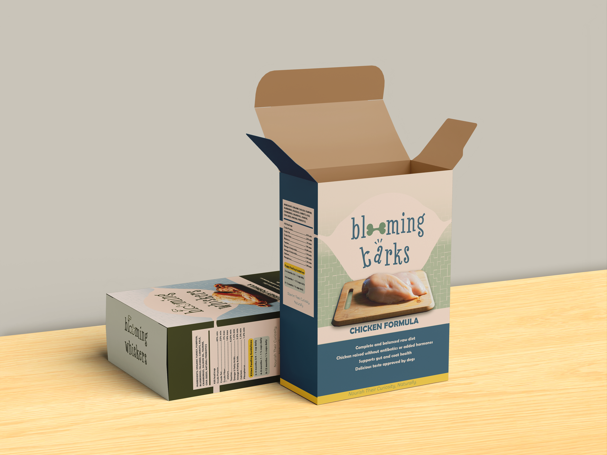
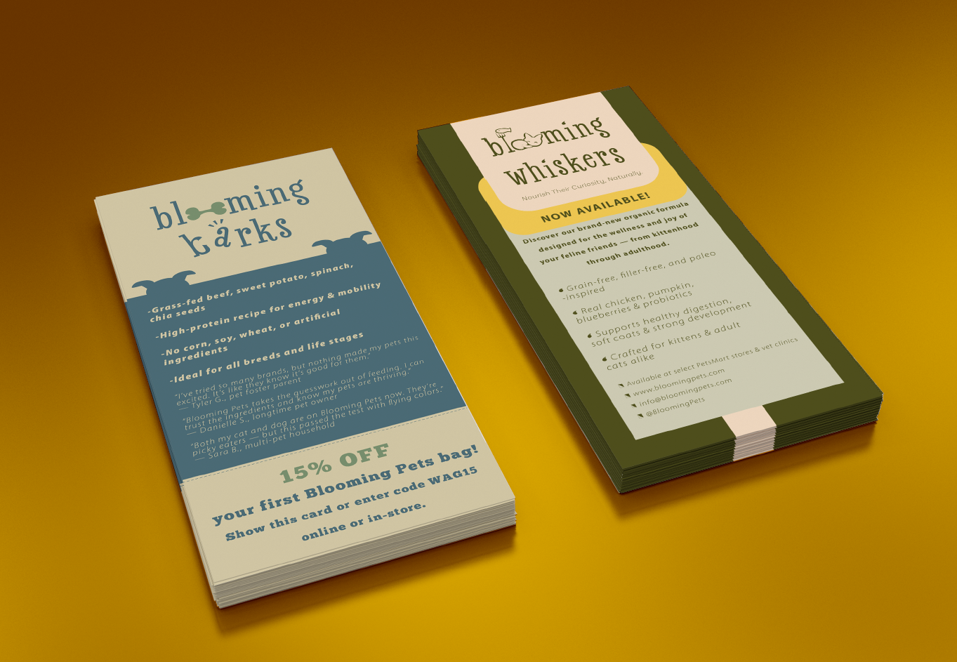
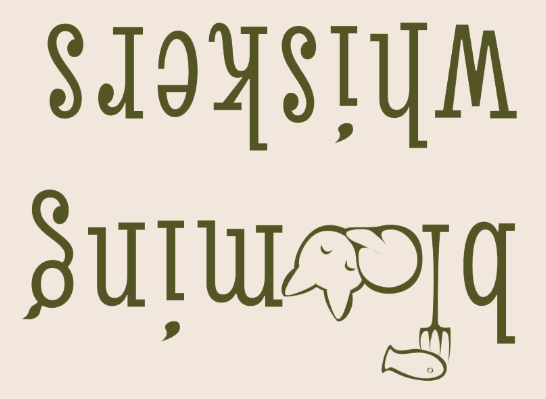
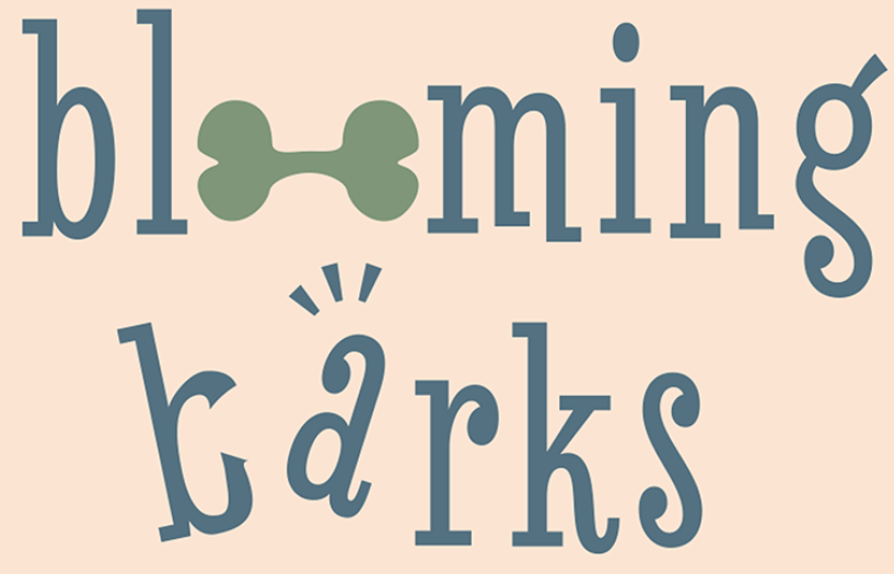
It was important for Blooming Pets to have two distinct food brands for both kittens and puppies. Diets specifically curated to their species. They wanted to ensure that the brand is not only cohesive across the species, but for it to feel unique for the consumer. Designing two different logos for their focused pets, it was a process of ensuring the font stayed the same while different icon designs in each.
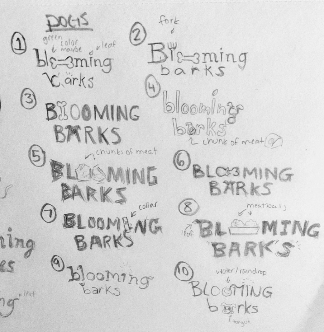
Logo design
While the goal of Blooming Pets is to be an all natural diet, they want to present themselves as a company that’s friendly, sweet. Since their diets cater to specifically kittens and puppies, playfulness of the font was imperative. The varying characters on the baseline along with the loopy tails, bowls and ball terminals are what helped add charm to the logo. It was carefree yet with the serifs added a balance of structure.
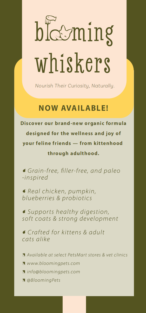
The tittles being transformed into leaves was a way to display the naturalness of the diet. The colors green/blue became a staple to help solidify that. The ‘oo’ ‘s in Blooming being transformed into icons for their respective species. The decision of ‘b’ in barks to have the bowl be cut open and “scare” the ‘a’ was made to add a level of liveness to the logo.
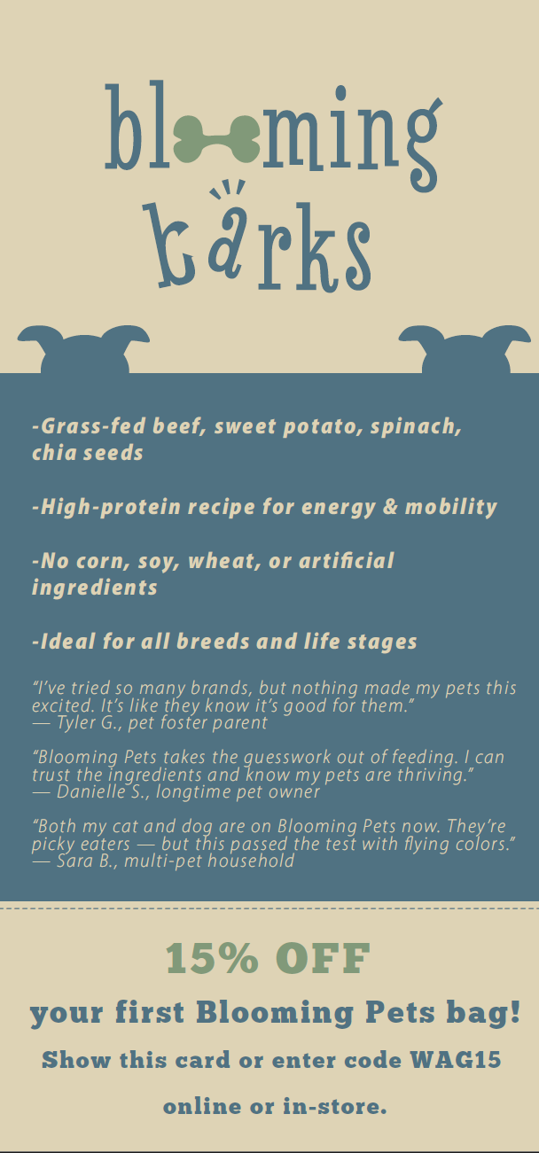
BRANDING
With Blooming Pets foundation of who they are and how they represent themselves now well rooted, crafting the branding was next. With affordable pricing, the colors combined with imagery needed to look approachable and easy to grab. The intent for anyone to come in at any level of pet care knowledge and assuredly know they’re reaching for not something cheap and ok, but affordable and amazing for their pet. Simple to not be too cluttered, but complex enough to reassure legitimacy.
Packaging food that was secure and easy to grab, alongside rack cards that can be found at any store or vet waiting room for more information, reviews and coupons.