SOJOURN AIRLINES
LOGO • BRANDING • COLLATERAL
overview
SoJourn Airlines is an airlines company found across the globe, based in the United States. In the name sojourn, it means a temporary short stay. Often used during travel and with how many people go through airports, it’s SoJourns goal to make the temporary stay as relaxing as possible. Where the smooth transition from everyday life to vacation, starts at the airport
logo design
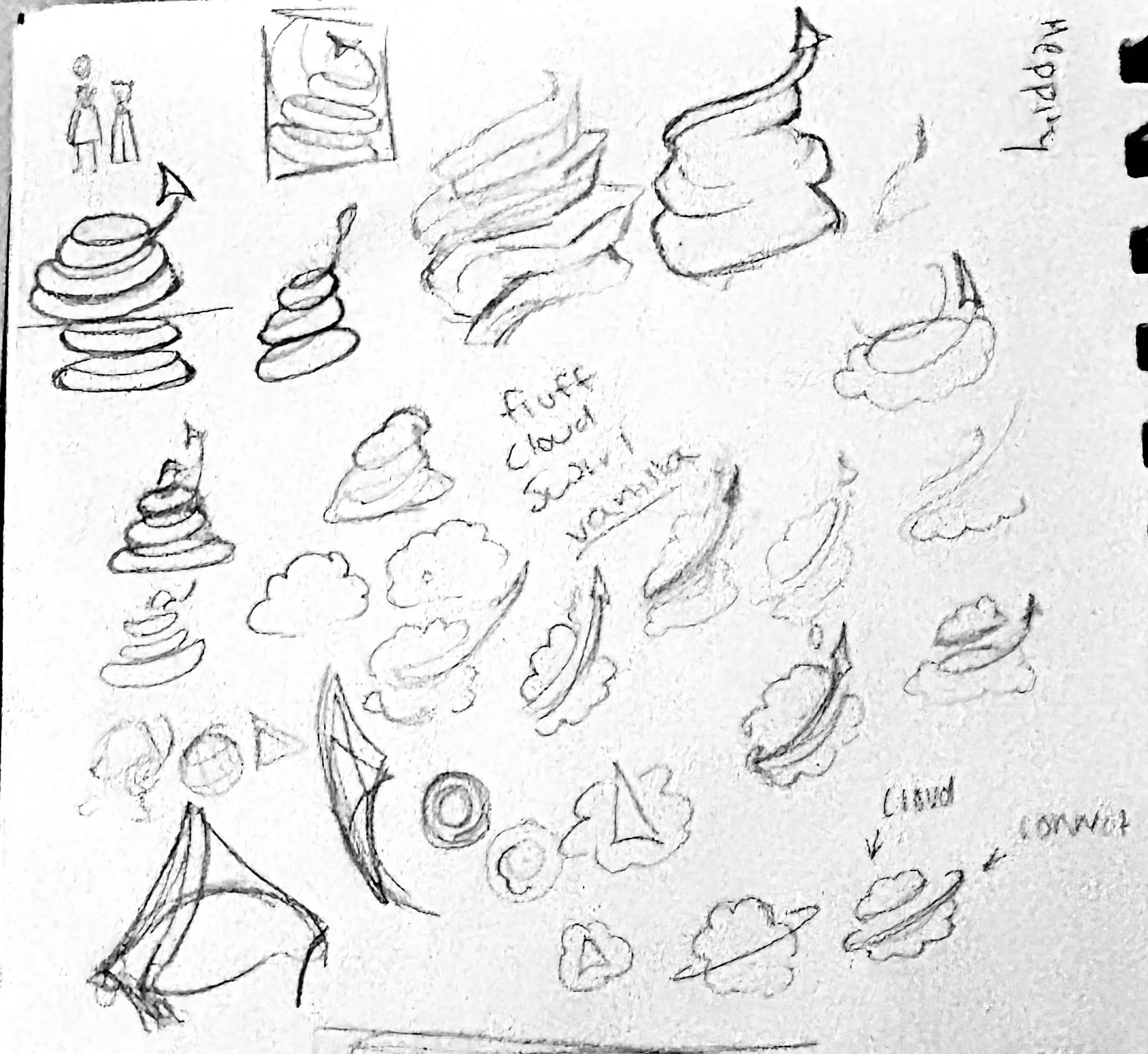
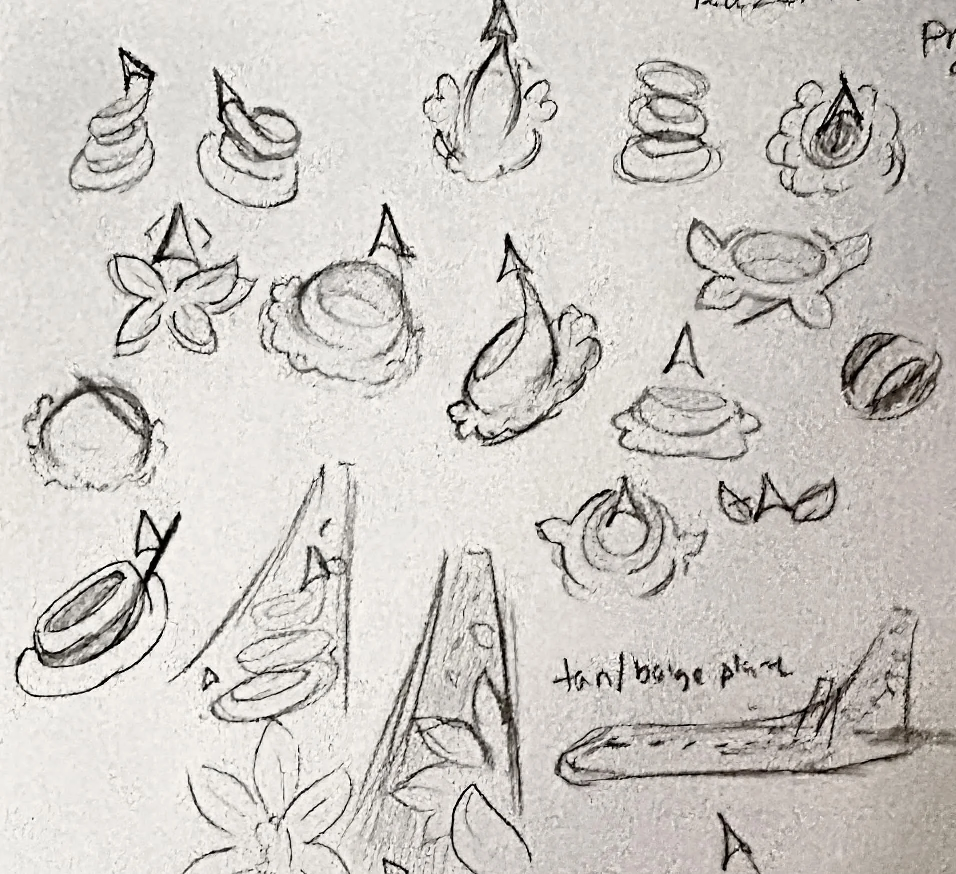
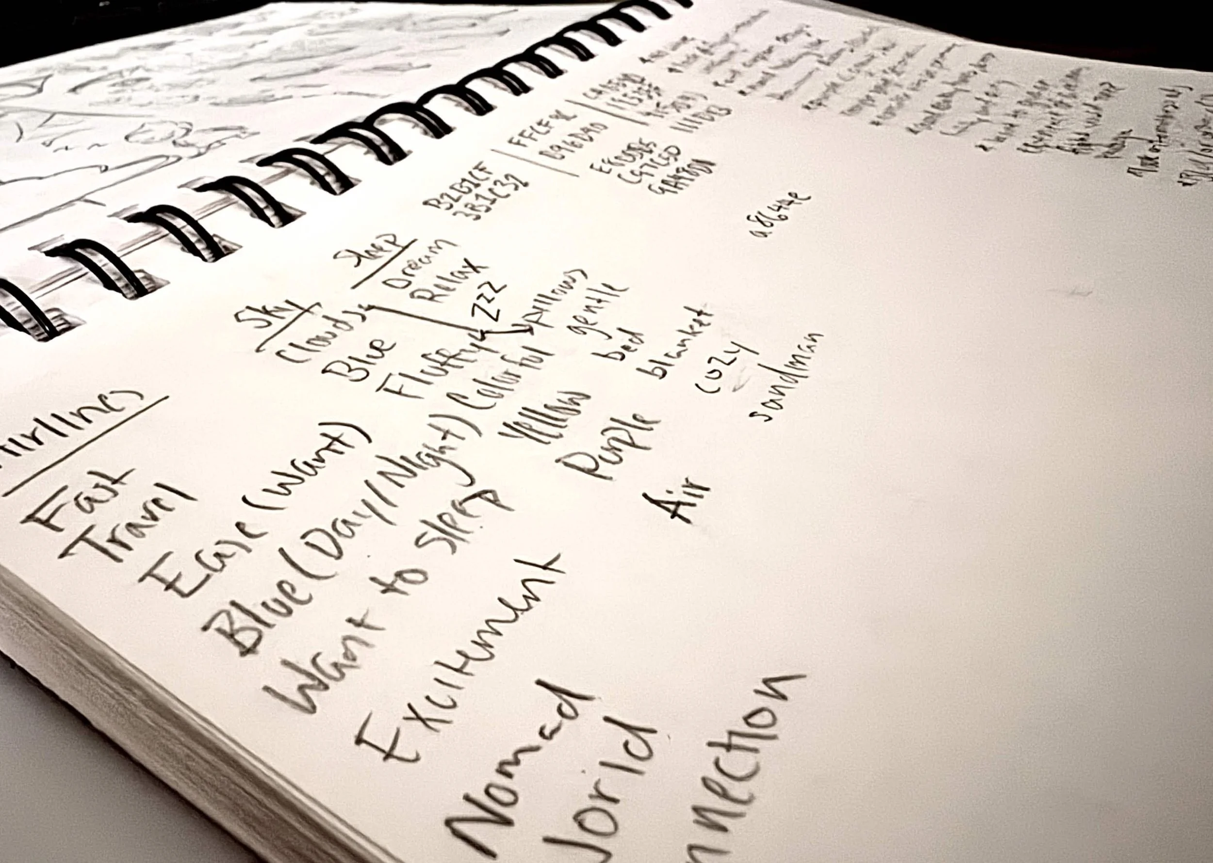
Building up the logo was a process of finding what SoJourn wanted to represent. Understanding that their goal was to be seen as a relaxing temporary stay before the customer heads to where they must go, it was important to establish what relaxing means. What people find relaxing, they find easy to do and not just easy, but cleanly. Establishing elegance became another important factor during the design process.
ICON DESIGN
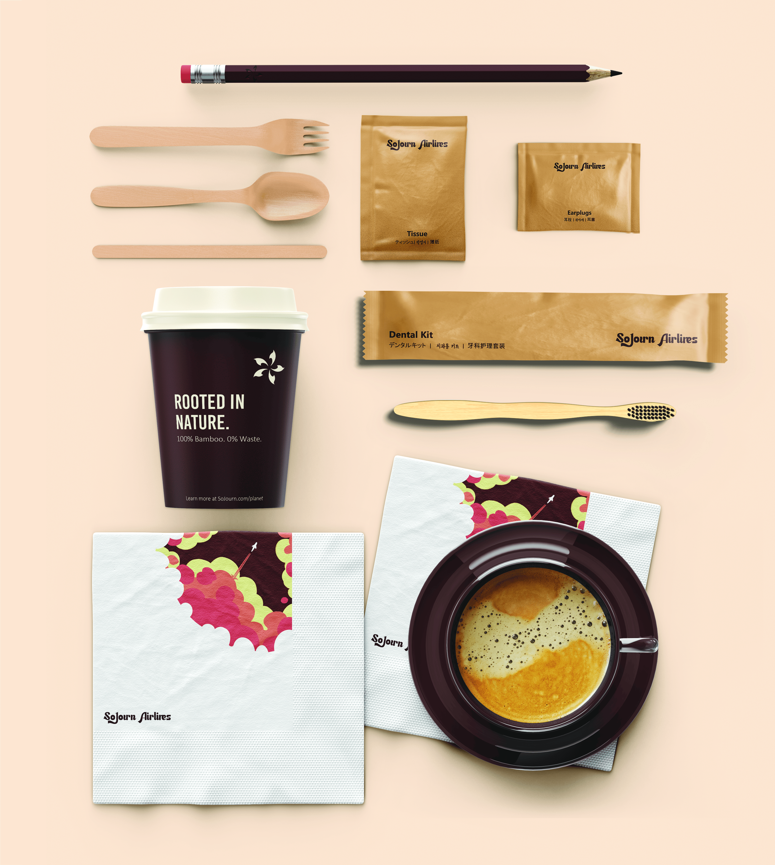
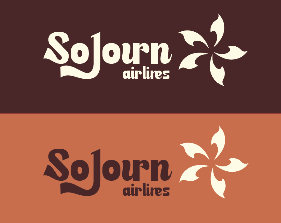
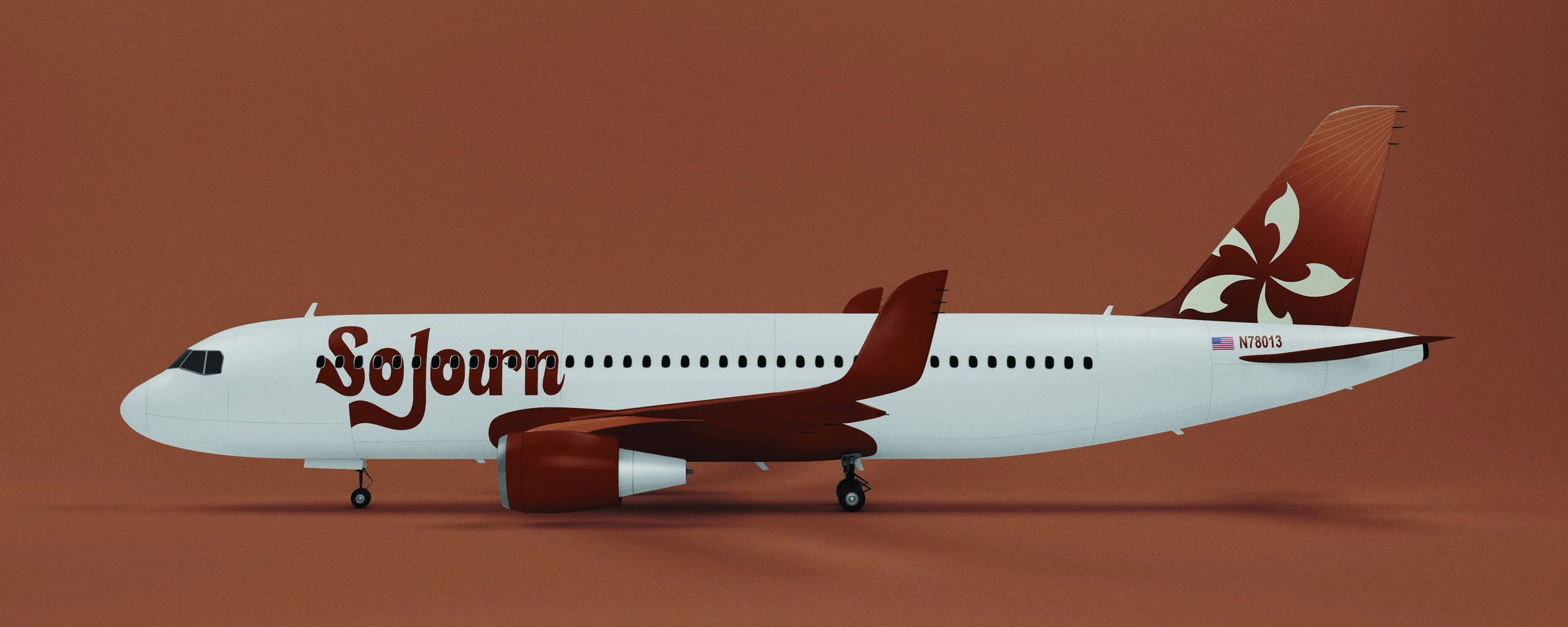
With any brand, it’s important to stand out against competitor airlines. While keeping in mind elegance and relaxation, the color scheme that bloomed became browns, soft oranges and white. Established through the sketching process, a flower came to form inspired by vanilla. The icon not just representing vanilla, but how the swirls mimic the ice cream and different aircrafts taking off in different directions.
The font chosen for SoJourn Airlines followed the same principle. Where the characters had to hold a level of professionalism, legibility and elegance with a touch of softness to redirect back to the main goal of SoJourn Airlines - relaxation, calm, easiness. While an airport can be anything but those things, it’s their goal to always strive to be that. Make it as easy as possible for the consumer.
The curvature of the ‘S’ and ‘J’ brought immediate grace and refinement. Where the ‘J’ descender fluidly wraps around ‘So’, helping frame the rest of the word while elevating it’s beauty. The ‘ur’ being attached in one stroke, alongside the ‘S’ and ‘J’ all combined established a standout logo among other airlines. It becomes easily identifiable while maintaining the roots of SoJourn Airlines.

BRANDING
SoJourn’s identity now well established, it was time to build up the brand. It was important that the crew reflected the values of the airline. To support this, it was planned to extend the brand across any interaction crew and consumer may come across day to day. SoJourn not only wanted to emphasized it’s natural elegance but embrace the natural. Going through the meticulous process of ensuring their amenities are recyclable and waste free.