Cove Cuisine
LOGO • BRANDING • COLLATERAL
Cove Cuisine is a fast food restaurant often found across the coastline throughout the nation. Learning the culture of the restaurant and what they value helped shaped the brand to focus on family and the ease of vacation. Creating a logo that evolved into a brand collateral.
overview

LOGO DESIGn
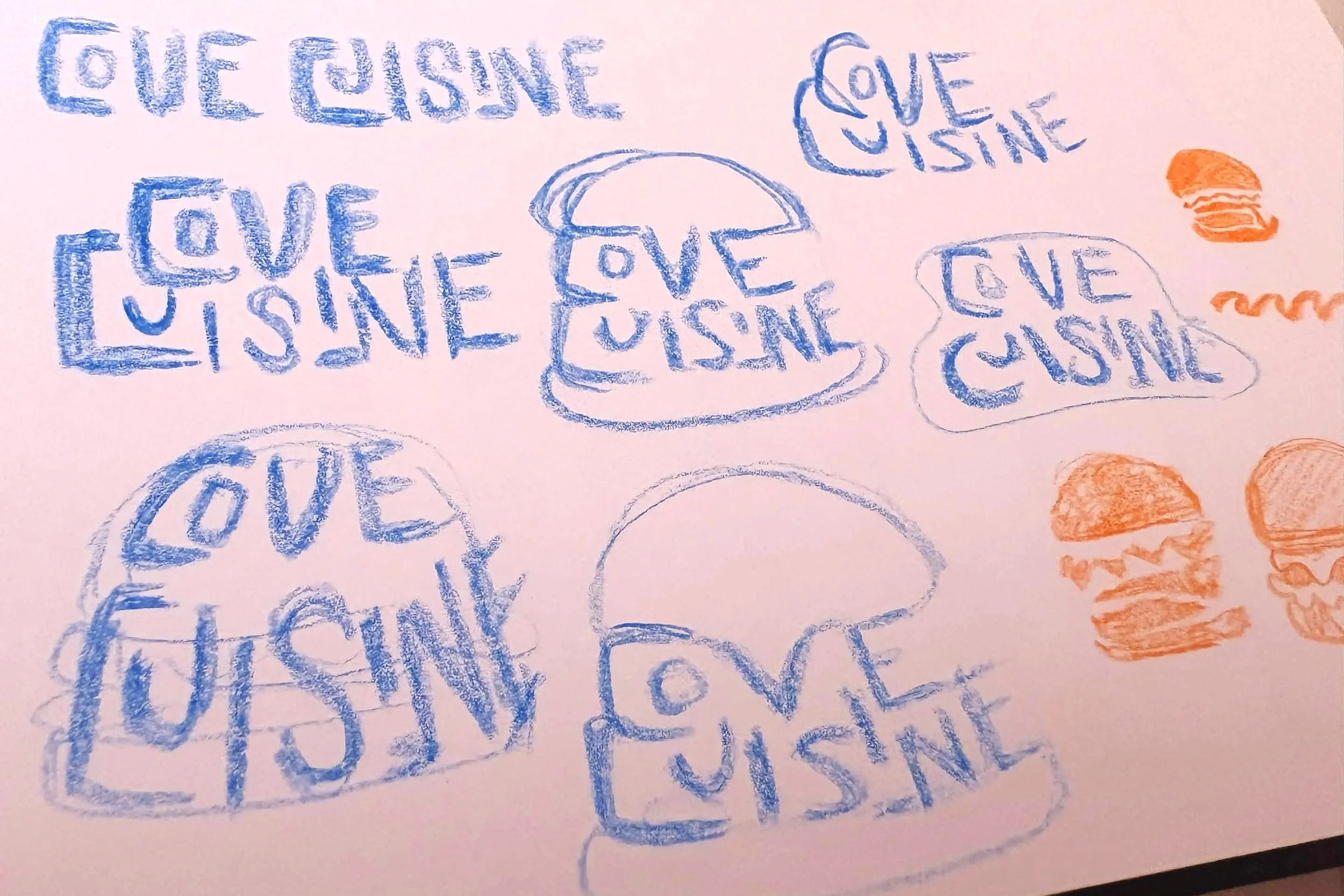
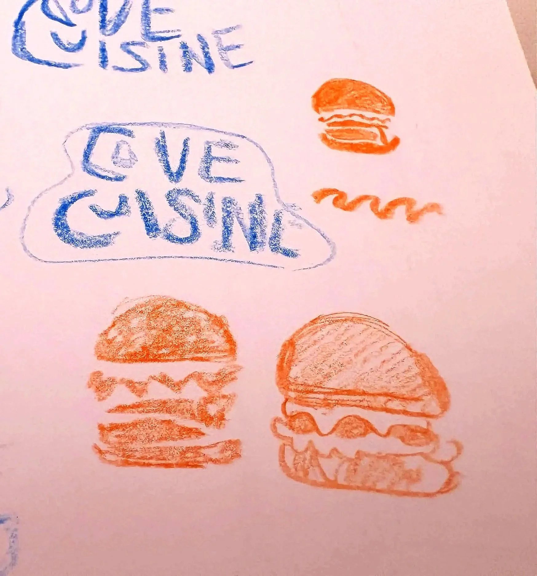
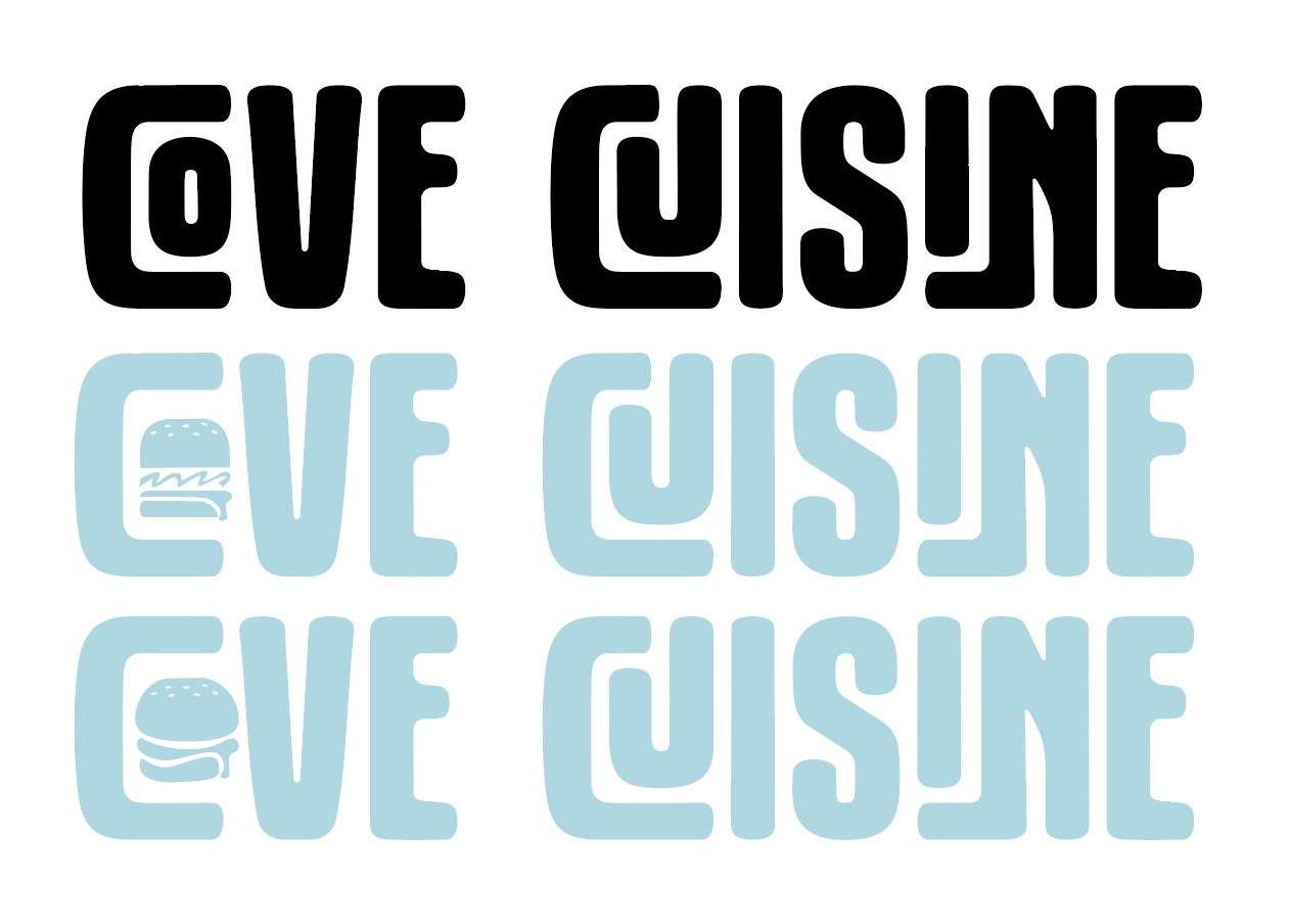
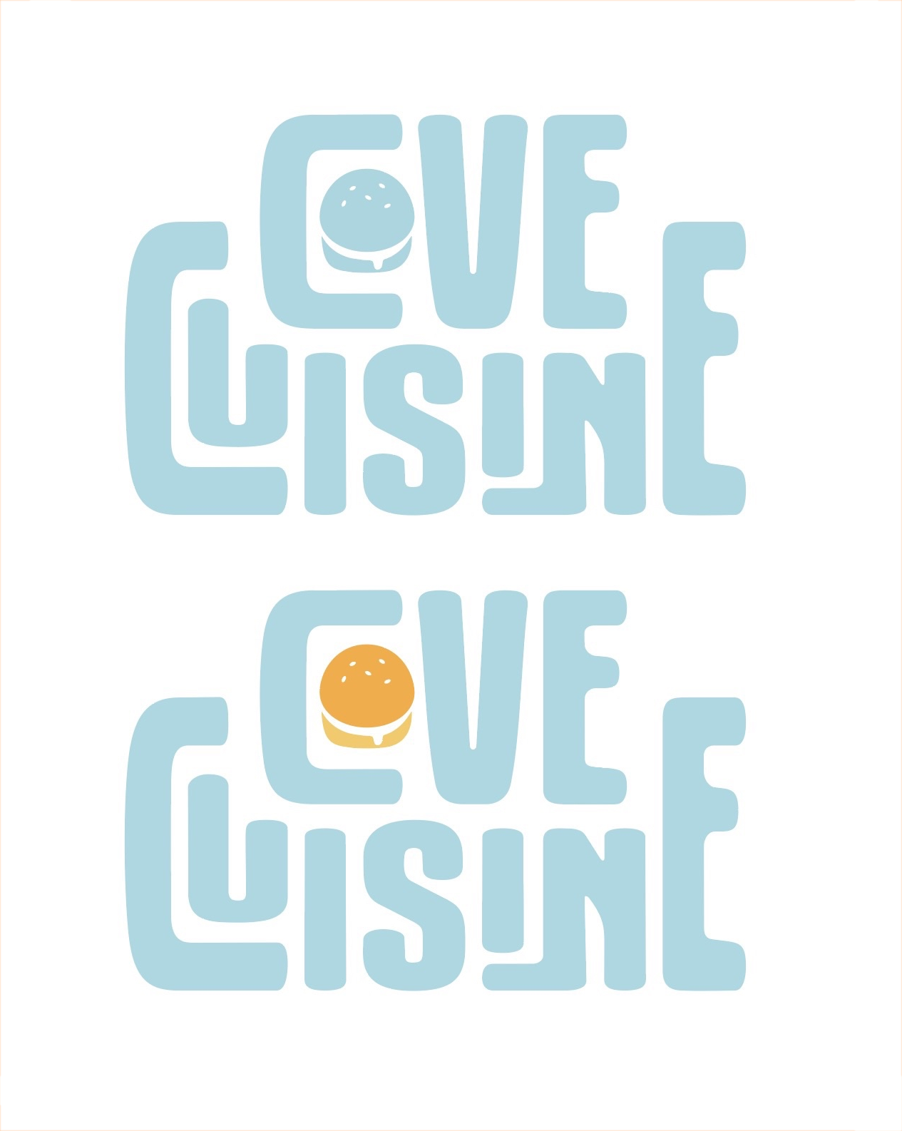
As with any branding project, the name and look of the logo becomes the foundation we build upon regarding design. The name Cove Cuisine was specifically chosen to roll off the tongue and easily identify what it stood for. Cove to think of a beach and water. Cuisine to think of food but match with the word cove. The softness of the letters throughout the font chosen was not only distinct but helped emphasized the family fun relax time Cove Cuisine wanted to capture. Customizing the letters to easily fit in together created memorability and further demonstrated the ease and playfulness of the font.
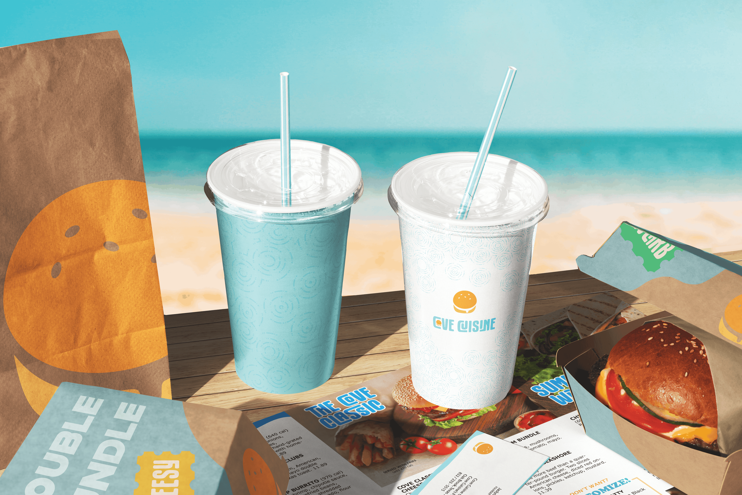
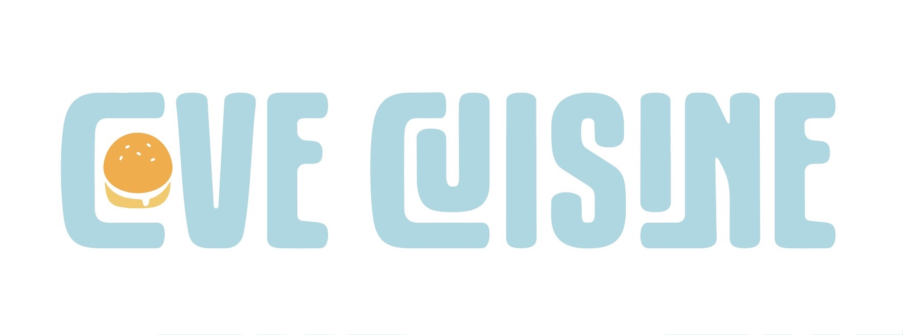
Blues and oranges were used to push the beach, sunsets and burger atmosphere. Becoming the base color scheme for the rest of the designs.
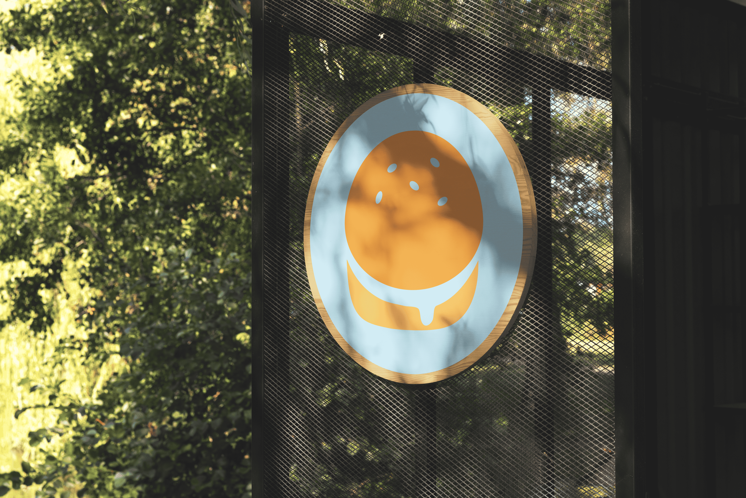
Icon DESIGn
The letters of the font fit together like puzzle pieces. With the ‘o’ nestled neatly within the C, it was only natural to design an icon out of it. Starting by illustrating a detailed burger and breaking it down to it’s most basic shapes. The goal was to keep it iconic while remaining readability. Through testing, non-designers were asked how they read it without informing them of anything else regarding the brand. Results kept coming back as it being read as ‘Cave’ instead of ‘Cove’, so while the icon was well illustrated, the restaurant needed more. When a child was asked how they read the logo, they read ‘Cave’ as well, it was a humbling reality that the icon had strayed too far from the restaurants core values. Being a family friendly location that was an easy nice place to eat at vacation. However, it can’t be family friendly if the kids themselves can’t read it. It lead to the final design icon where it went through the same testing with non-designers and it found greater success.

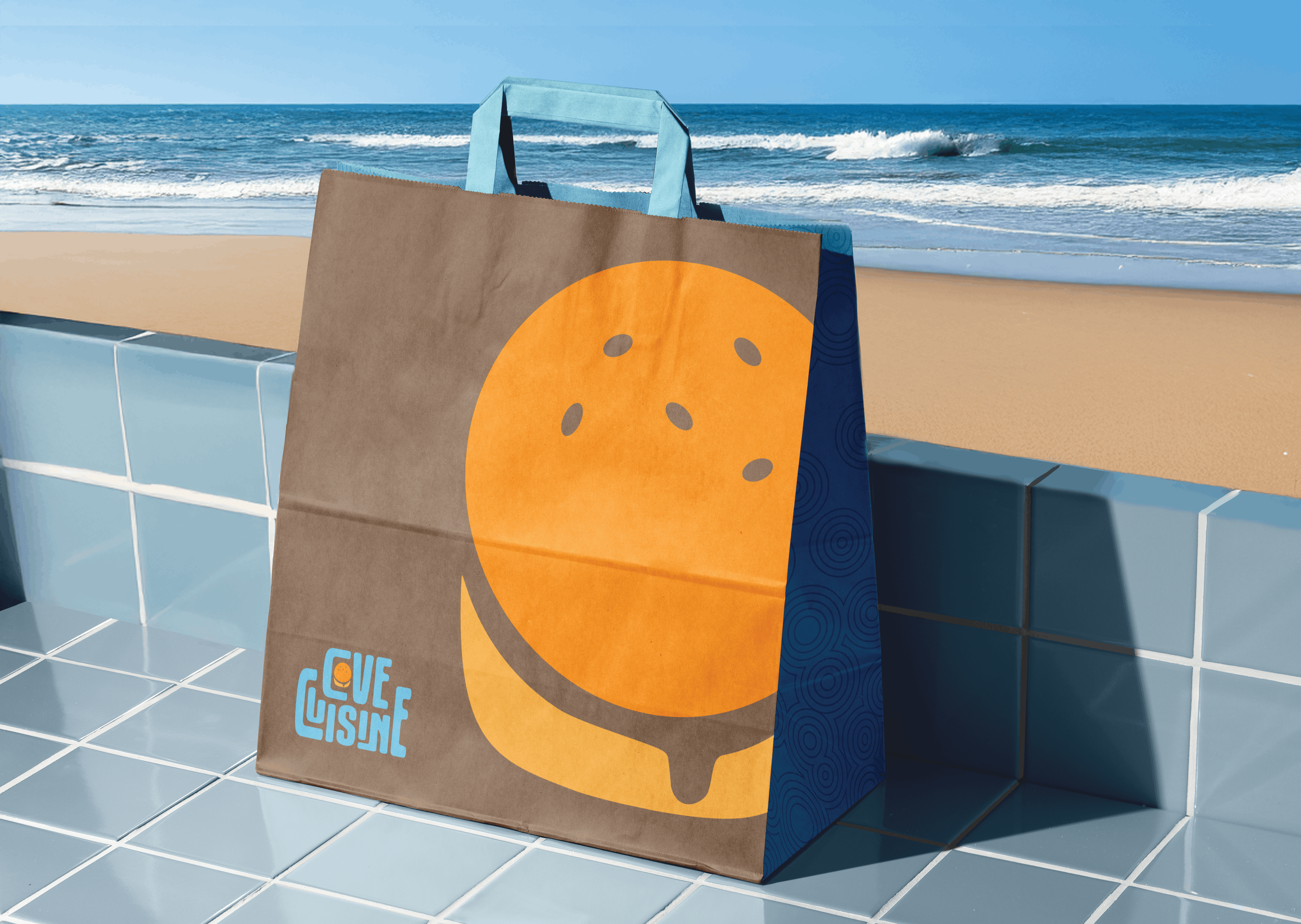
Branding
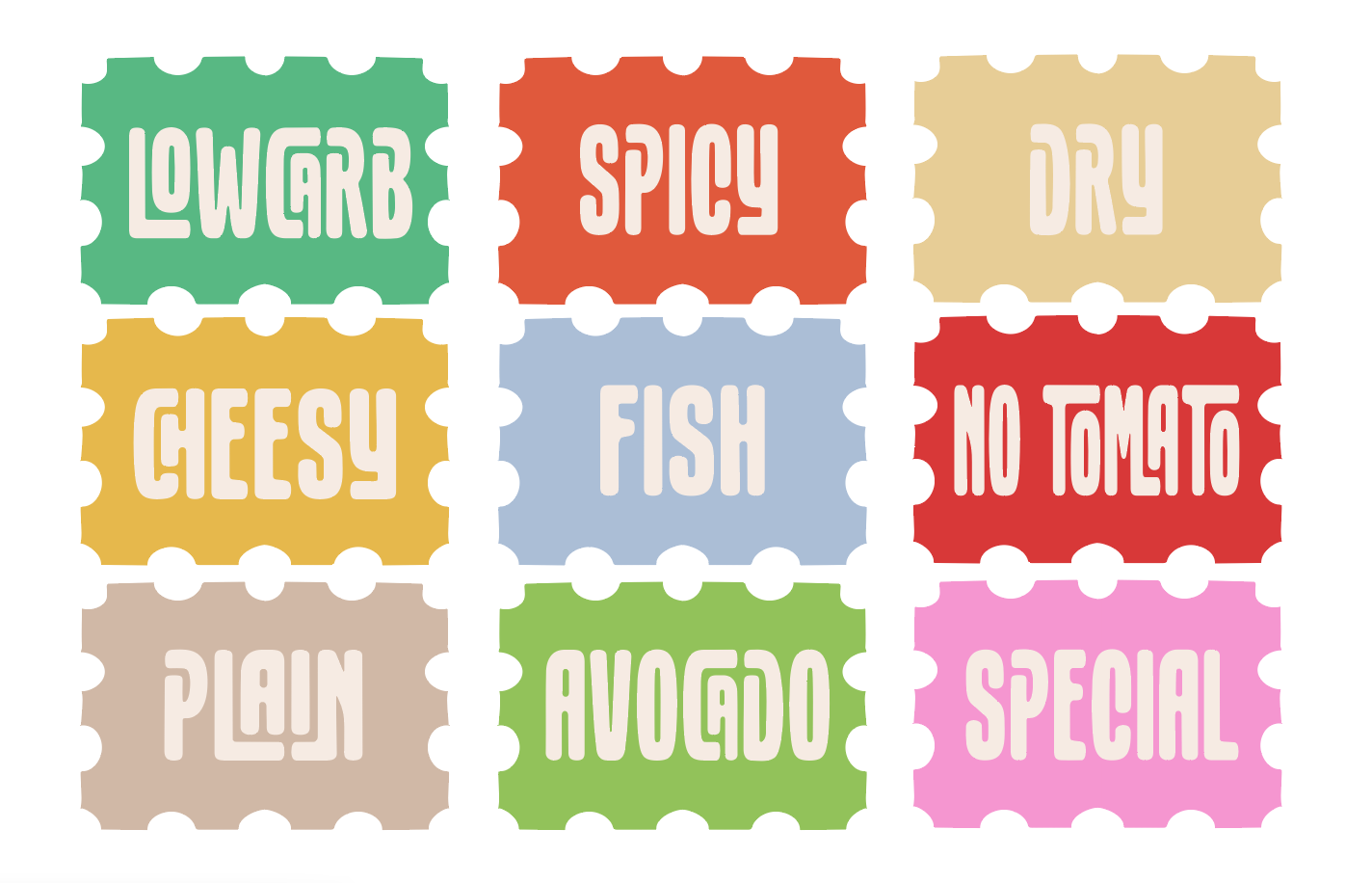
With a foundation built, it was time to flesh out the look of the brand. It was important to keep the lightheartedness throughout and stimulate thoughts of water. Often using waves or ripple patterns to convey that. Adding along stamps to orders for employees to use that help add a playful element for kids or young hearts who enjoy collecting